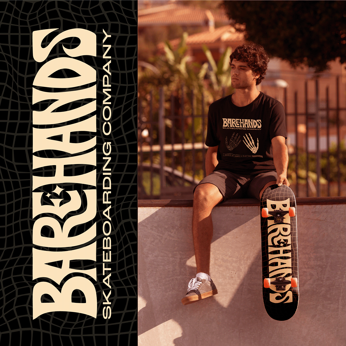
As a personal project, I found a design brief on Instagram and decided to create the vision for this fictional skateboarding company; Bare Hands. The brief wanted the look to be bold, edgy, alternative, and energetic - and I also added my own flare of retro. I decided to make the brand based out of Toronto, Canada, with a target audience of 19-25 year olds interested in skateboarding and comfortable apparel.
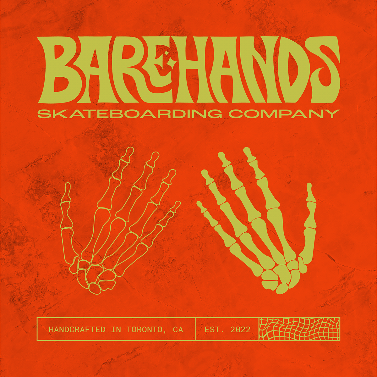
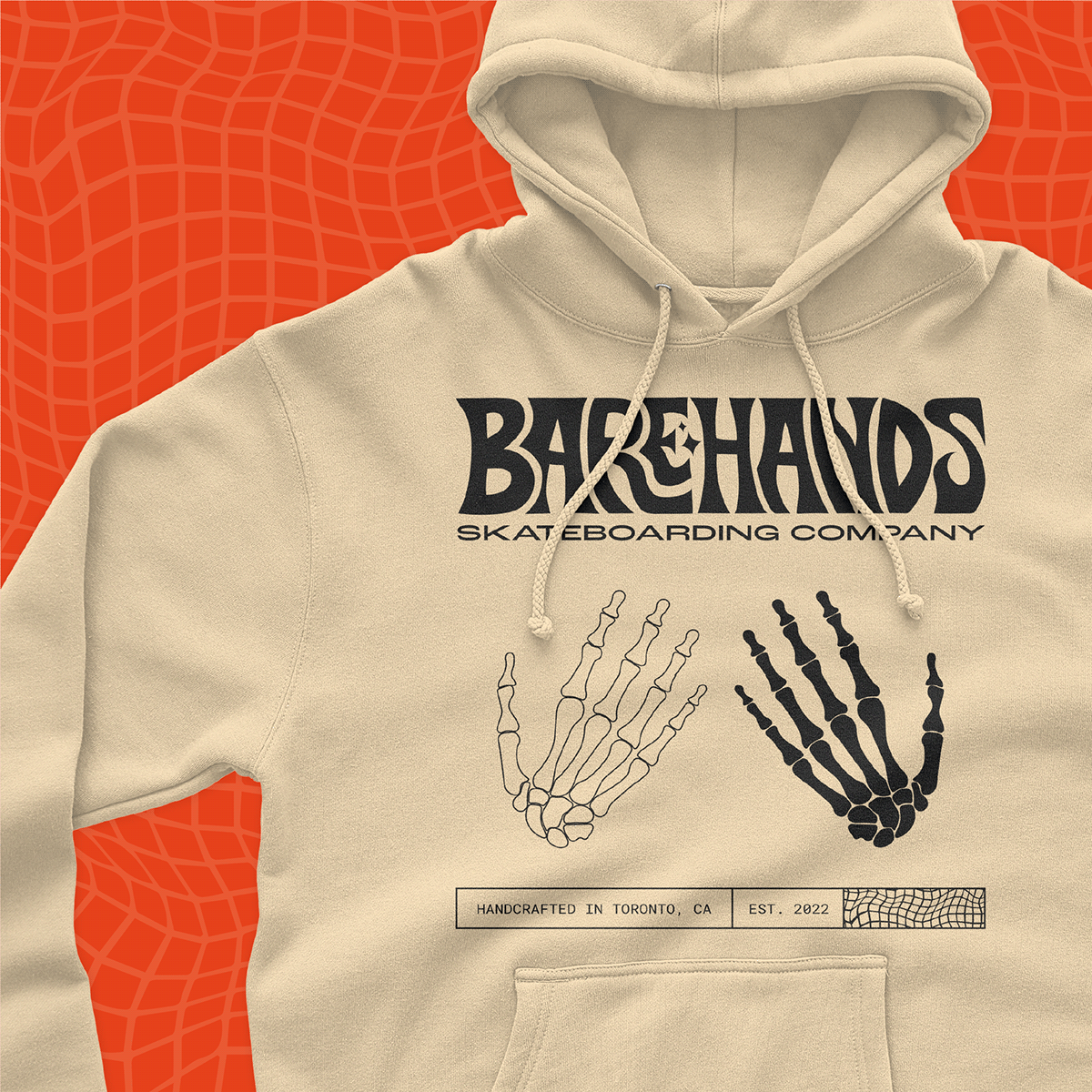
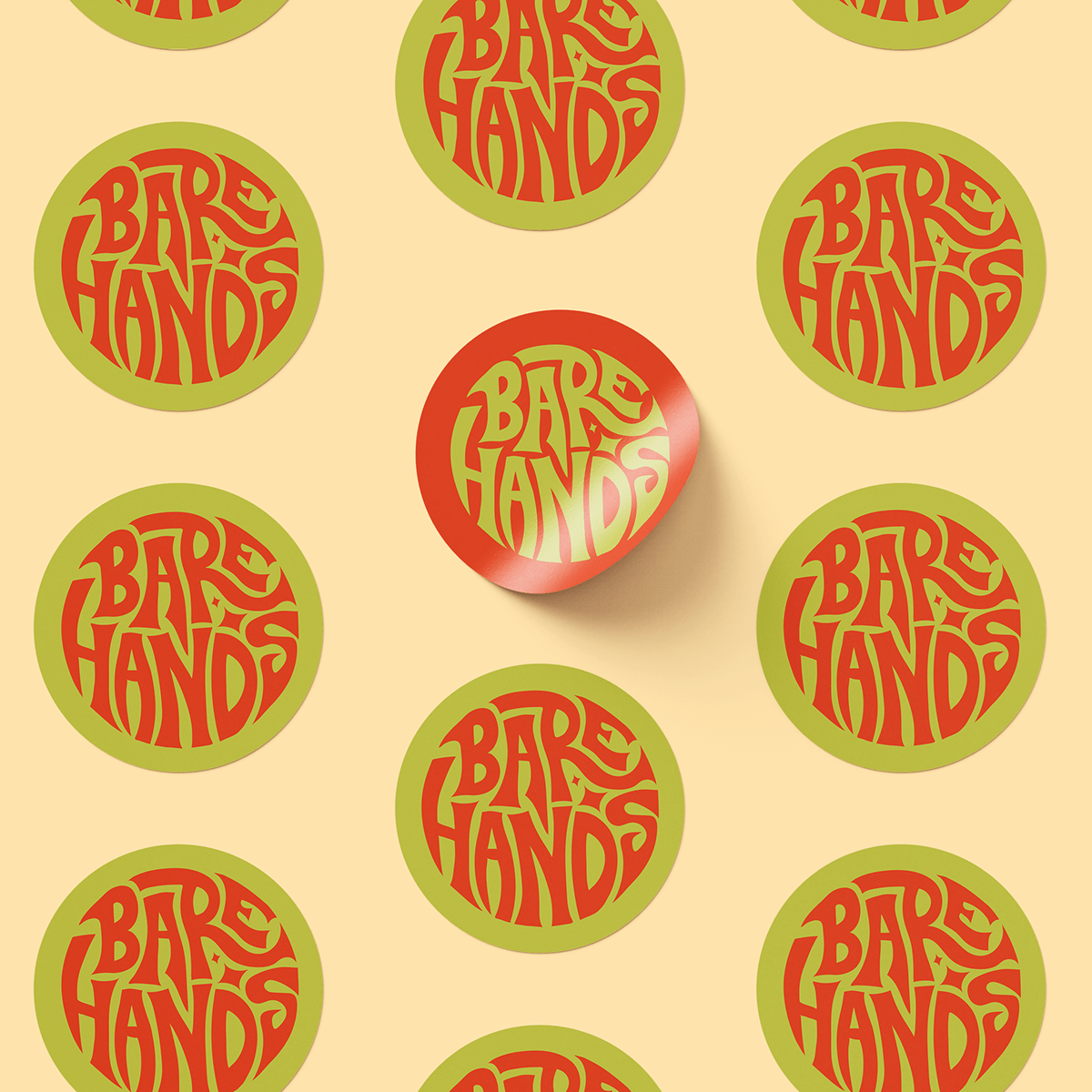
For the logo creation, I took inspiration from other skate brands like Thrasher and Vans. I knew I wanted to create a unique logotype that would stand out on the chest of a t-shirt, as well as fit into a circular form for social media and other branding aspects.
I really got my use out of the Pencil tool hand-drawing the logotype, which was super fun. I created an interesting dynamic of sharp and smooth that allow the letters to warp into each other. That warping concept was carried through the brand pattern; the warped grid.
The juicy brand colours were inspired by Scooby-Doo - which give that bold, energetic feel. All in all, very happy with the logo variations and colour palette all together.